







YouTube Is Redesigning Its Desktop Interface Again: Comments Move to the Right, Recommendations Get Pushed Down
 ·
07.10.2026 20:04
·
2 min read
·
07.10.2026 20:04
·
2 min read
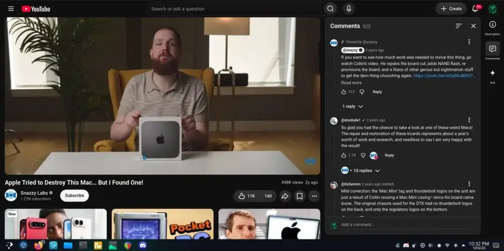
The YouTube team has kicked off another round of large-scale A/B testing on the desktop version of the video platform. Some computer users suddenly found that the familiar layout of the watch page, unchanged for years, had been turned upside down: the comments section and video description now open by default in a wide column to the right of the player, while recommended videos have dropped to the bottom as a massive tile, Android Authority reports.
Previously, the right column was traditionally reserved for the list of upcoming content, while discussion happened below the video itself. In the new layout, it’s the other way around, which makes the video player noticeably narrower on standard 16:9 monitors, freeing up a third of the screen for text messages.
A Narrow Player and a Wave of Criticism on Reddit
The experiment instantly annoyed viewers. In discussions in the Reddit community, viewers complain about a feeling of crampedness: the player loses its dominant position, and the expanded comments panel visually clutters the screen. Users call the design a “stretched mobile app” and note that for many, the panel activates automatically when the page opens.
Still, the layout has found its supporters. Some viewers appreciated being able to read timestamps, arguments and the creator’s replies in real time without scrolling down and losing sight of the video.
A Second Attempt After the 2024 Backlash
For the service, this is not a spontaneous experiment but a return to a long-standing idea. Google already tried to roll out a similar layout in spring 2024, but after harsh criticism from content creators and viewers, the large-scale deployment was pulled back.
From the platform’s perspective, the logic is simple: keeping attention. When a viewer scrolls down for comments, they stop actively watching the video, which reduces engagement. A side chat solves this problem, turning any video into something like a live stream with a streaming chat on the side.
For now, the new interface is available only to a random sample of users, and the layout itself varies from account to account: in some cases the panel is expanded by default, while in others it requires clicking a separate button. There has been no official announcement of a global redesign, and if audience resistance turns out to be too high again, Google may once again pause the experiment.